Animated bar graphs in R
Last week I saw this post on Twitter where Adam Spannbauer visualized an animated ‘growing’ bar graph in R. Pretty impressive!

Is an animated graph contributing to a better understanding?
From the comments and a related second post it became clear, that this animation was visually appealing, but in no way contributing to a better understanding of the data behind the graph.
So I sat down and thought about requirements for an animated bar chart that can be embedded in a presentation and contribute (maybe) to a better understanding:
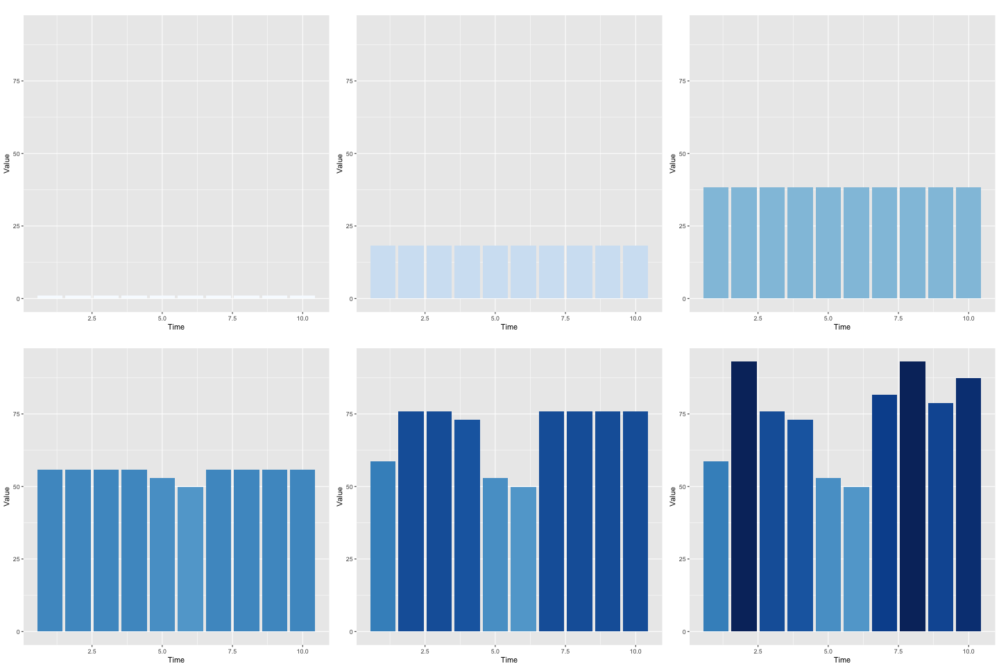
- all bars should start simultaneously from the bottom and grow to the top with the same speed
- when a sample reaches its maximum value it should stop growing
- its maximum values should be displayed until plot stops
- Carefully consider use of color (gradient colors)
- Do not animate every single bar chart, listeners are not used to it and will be confused rapidly
In general, animations should be used very wisely, but can be a great option for telling a story.
Toy example of a possible solution
I will guide you trough the steps necessary to generate an animated bar graph in R. Down here you can find the R code, which you can also copy from my Github repository. I should mention that I only had to modify a few lines from @SPannbauers code.
# 1. step: Load all packages we need ----------------------------------------------------------------------------

library(data.table)     #order/add/modify/delete data
library(gganimate)      #create easy animations with ggplot2
library(RColorBrewer)   #Provides color schemes
library(ggplot2)        #A system for 'declaratively' creating graphics
# 2. step: Toy example ------------------------------------------------------------------------------------------

#toy example data
dt = data.table(time=1:10, x=round(runif(10, 50, 100), 0))

#number of frames per bar during animation
n_frames_per_bar = 33

#split dataset (e.g. every sample displayed on x-axis)
split_dt = split(dt, dt$time)

#split every sample (from 1 to maximum, in n_frames_per_bar steps)
split_dt_fill = lapply(split_dt, function(dti) {
  data.table(time=dti$time, x=seq(1, dti$x, by = max(dt$x)/n_frames_per_bar))
})

#every sample now has the same number of datapoints (absent datapoints are filled with max.value)
split_dt_fill2 <- lapply(split_dt_fill, function(dti){
  if (nrow(dti) < n_frames_per_bar){
    add_table <- data.table(time = dti$time[1], x = max(dti$x))
    dti <- rbind(dti, as.data.frame(lapply(add_table,function(x)rep(x,n_frames_per_bar - nrow(dti)))))
  }
  else{
    dti <- dti
  }
})

#bind together all the different samples (or 'time' points)
dt_fill = rbindlist(split_dt_fill2)

#id each row as its own frame for every 'time' | add column 'frame'
dt_fill[,frame := rep(1:n_frames_per_bar,10)]

#plot using ggplot2 (gganimate's frame arg in aes)
p = ggplot(dt_fill, aes(x=time, y=x, frame=frame, fill = x)) +
  geom_bar(stat="identity", position = "identity") +
  guides(fill=FALSE) +
  scale_fill_gradientn(colours = brewer.pal(9, "Blues")) +
  labs(x="Time", y="Value", title="")

#create gif (using interval to specify the time per frame)
gganimate(p, title_frame = FALSE, interval = .001)

I hope that this kind of animation is best suited for highlighting unexpected outliers in a presentation. And of course, it is very easy to play around with animation speed or changing colors to transport the story you want to tell.

Leave a Comment