The power of interactive plots
At the beginning of the year, I remember myself staring at the screen, sitting on a bunch of genomic data and thinking:
“Man, it would be really helpful to hover over my data points and check what properties they have…”
As this may seem a bit nerdy, nowadays dynamic content has become quite natural and offers a whole new range of possibilities especially when dealing with large, complex data sets.
(Sometimes) Do not be static!
Don´t get me wrong. Static graphics can be great and are inevitable for print media.
And as long as you are working on two-dimensional data, it is not a problem at all and in fact more or less the only reasonable option you have.
But, imagine adding another layer of information. And another one. And so on… (I think you get the point here)
Unfortunately, our imagination is not made for multi-dimensional data. How is it possible to include all of the additional information in your plot?
In this case, it is common practice to use different colors, sizes, transparencies, shapes or to split up your plot.
However, building a meaningful and informative static plot from multi-dimensional data can be quite hard. Why not consider how to make graphics interactive and benefit from all the clicking and zooming we are used to?
Actually, it is not that hard using R and the Plotly R library. This package is built upon the amazing D3.js, which requires at least some skills in HTML, CSS and JavaScript. Therefore, Plotly brings major benefits, because it is easy to use and compatible with a number of languages (R, Python, MATLAB..).
I will try to convince you, that interactive visualization can make a huge difference during exploratory data analysis.
Example data set: Most profitable movies of all time
For the first analysis steps of the movie data set from KAGGLE, please go back to my last article.
# 1. step: Load all packages we need ----------------------------------------------------------------------------

library(dplyr)
library(ggplot2)
library(plotly)
library(viridis)
library(gganimate)
library(webshot)
# 2. step: Load data (CSV file) from KAGGLE ---------------------------------------------------------------------

movie_file <- path_to_file            # download first then specify absolute or relative filepath in "/.../.."
imdb_data <- read.csv(movie_file)     # base function of R to read a CommaSeparatedFile
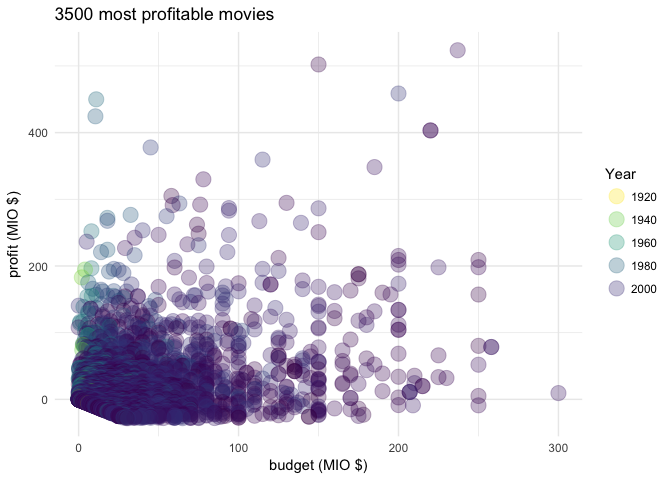
What is the most profitable movie of all time? Plot budget on the x-axis and profit on the y-axis, colored by release-year of the movie.
# 3. step: Calculate profit and plot movies ---------------------------------------------------------------------

gg_profit <- imdb_data %>%
  mutate(profit = gross - budget) %>%
  arrange(desc(profit)) %>%
  top_n(3500, profit) %>%
  ggplot(aes(x = budget/1000000, y = profit/1000000,
             col = title_year,
             text = sprintf("%s<br>%s", movie_title, title_year))) +  # text will be displayed in plotly
    geom_point(size = 5, alpha = 0.3) +
    theme_minimal() +
    scale_color_gradientn(colours = rev(viridis_pal(option = "viridis")(40))) +
    labs(x = "budget (MIO $)", y = "profit (MIO $)") +
    guides(col=guide_legend(title="Year")) +
    ggtitle("3500 most profitable movies")

print(gg_profit)

Can you guess what this highest point on the x-axis is representing?
As we are already plotting three-dimensional data (profit, budget, year), the best thing we can do is to make the plot interactive.
# 4. step: Let´s make it interactive ----------------------------------------------------------------------------

ggplotly(gg_profit, tooltip = "text")           # yes, that´s all you need!
That was easy. When you hover over the data points you can read every single movie title (Best way to experience interactivity is of course not on your smartphone).
If you even want to go one step further, you can add an animation slider, to split up your movie data set.
# Alternative: Interactive & dynamic plot using plotly?  --------------------------------------------------------

gg_profit_dynamic <- imdb_data %>%
  mutate(profit = gross - budget) %>%
  arrange(desc(profit)) %>%
  top_n(3500, profit) %>%
  ggplot(aes(x = budget/1000000, y = profit/1000000,
             text = sprintf("%s<br>%s", movie_title, title_year),
             frame = title_year)) +         # add a frame; everything else stays the same
    geom_point(size = 5, alpha = 0.5, color = "lightblue") +
    theme_minimal() +
    labs(x = "budget (MIO $)", y = "profit (MIO $)") +
    guides(col=guide_legend(title="Year")) +
    ggtitle("3500 most profitable movies")


ggplotly(gg_profit_dynamic, tooltip = "text") %>%
  animation_opts(
    frame = 100, transition = 0, easing = "elastic", redraw = FALSE
  ) %>%
  animation_slider(
    currentvalue = list(prefix = "YEAR ")
  )
Takeaway: Make use of those two extra lines
Why is it not more common to use interactive graphs?
Probably because we have never learned how to do it, programming seems to be hard and eventually they cannot be used for publishing or printing.
But as the way we are communicating is changing, I am sure that the proportion of interactive graphics will also change dramatically. So, if you are already using R and ggplot graphics package for exploratory data analysis, keep in mind:
You will only need to add two extra lines of code to make your graphics interactive.
Learn Plotly or read some more about visualization?
Find examples on how to make any kind of plot with the Plotly R library.
Read about why nobody is using interactive infographics here.


Leave a Comment